An ordering solution for a local sushi restaurant aimed at individuals who are on the go and don’t have time to cook or wait for ordering in person.

Misaki Ordering App
The Problem:
Busy workers and parents lack the time to prepare meals throughout the week and wait to order food in person. Parents in particular can often feel pressure to provide food for their families which can be challenging when facing a busy schedule. Ordering and picking up food can often be a long and tedious process, especially for those with limited time and resources to plan meals.
The Goal:
Design an app for Misaki that allows users to quickly and easily order meals for pickup at any of their locations.
My Responsibilities:
Conducting Interviews • Paper and Digital Wireframes • Low and High-fidelity Prototyping • Conducting Usability Studies • Accounting for Accessibility • Iterating on Designs
Design Process
Empathize • Define • Ideate • Prototype • Test
Company:
Misaki
User Pain Points:
Overview
Role:
UX/UI Designer
UX Researcher
Product:
Misaki is a local small-scale sushi restaurant with four locations in the Denver, CO area. They offer a rotating menu of fresh sushi rolls and entrees. Misaki’s primary customers are workers and parents looking to quickly grab food to go for themselves or their families.
2
Accurate Orders
Users wanted to make sure orders were accurate so they didn’t have to wait for orders to be fixed.
Tools:
Figma
Miro
Photoshop
Team:
Kevin T.
Project Duration:
August 2023 - October 2023
Research Summary:
By conducting user interviews, I identified the primary user group to be working adults and parents. I found that these individuals have schedules that don’t always allow them the time to cook their own meals consistently throughout the week. I then created empathy maps to understand the users I was designing for and their needs.
Research showed that convenience and order accuracy were the primary pain points when ordering through a mobile app. Users wanted their orders to be quick, easy, and on time as frequently as possible.
1
Ease of Use
Users wanted an app that was easy to use and could be used to quickly place an order.
3
Saved Orders
Users wanted to have a way to save orders for future ordering so it would be an easier and quicker checkout.
4
Notifications
Users wanted to be notified and updated with the timing of their order and when it was ready for pickup.
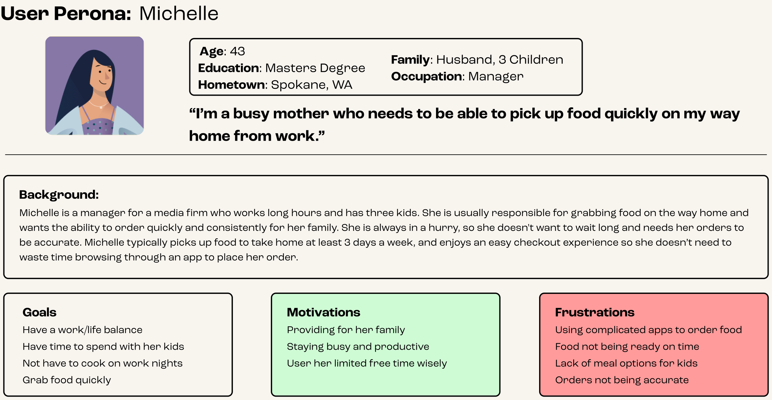
Mapping Michelle’s user journey showed how important it was to have quick and easy access to her order history for future ordering. Also having notifications and updates for her order status was helpful in planning her timing for picking up food on the way home.
User Journey Map

Competitive Analysis

Chipotle
Domino’s
Sonic
I conducted a competitive analysis of three different food ordering apps (Chipotle, Domino’s, and Sonic) in order to evaluate the strengths and areas of opportunity to help influence my design with the Misaki app. The analysis provided some key insights and features that have been established in popular apps on the market.

Paper Wireframes:
Taking the time to draft iterations of each screen of the app on paper ensured that the elements that made it to the digital wireframes would be well-suited to address user pain points. For the home screen, I prioritized a quick and easy ordering process to help save users time.

Digital Wireframes:
As the initial design phase continued, I made sure to base screen designs on feedback and findings from the user research.


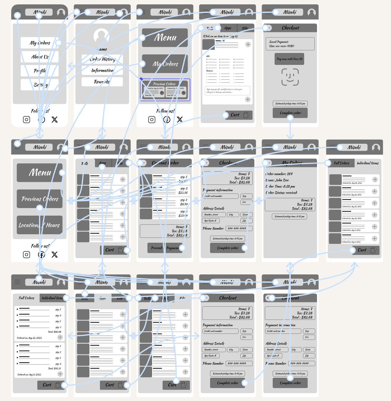
Low—fidelity Prototype:
The user flow begins at the home screen. From there, the user has the option to move to the menu or select from their previous order history. After items are selected, they can proceed to the checkout screen and receive an order confirmation once the order is placed.
Usability Study: Findings
I conducted 15-minute moderated usability tests of the low-fidelity and high-fidelity prototypes. After the tests, I gathered the feedback and organized my data into different categories.
Round 1 Findings:
Users need better and more readable menu items that aren’t too complicated.
Users need more clear direction to get back to their current orders from other screens.
Users understand the simple and clear layout of the checkout and payment screen.
Round 2 Findings:
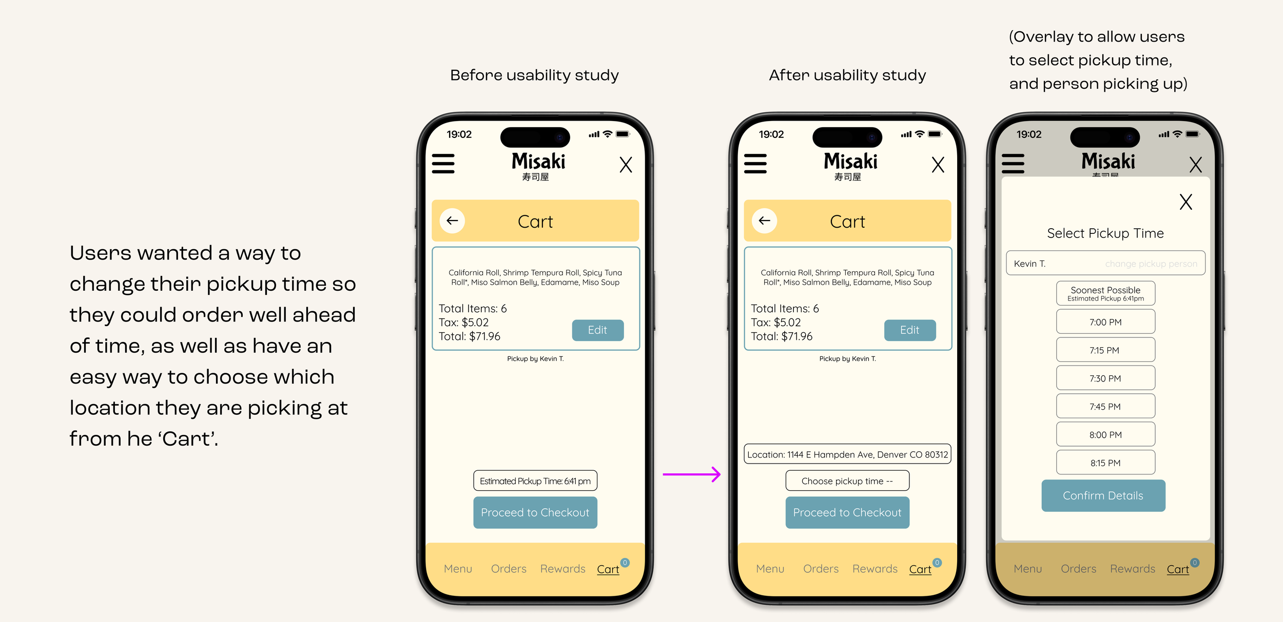
Adding and editing items is too confusing.
Users wanted a way to get back to their current order that was already in their cart.
Users want to change item quantities either from the Menu or Checkout screens.

Mockup Iterations:

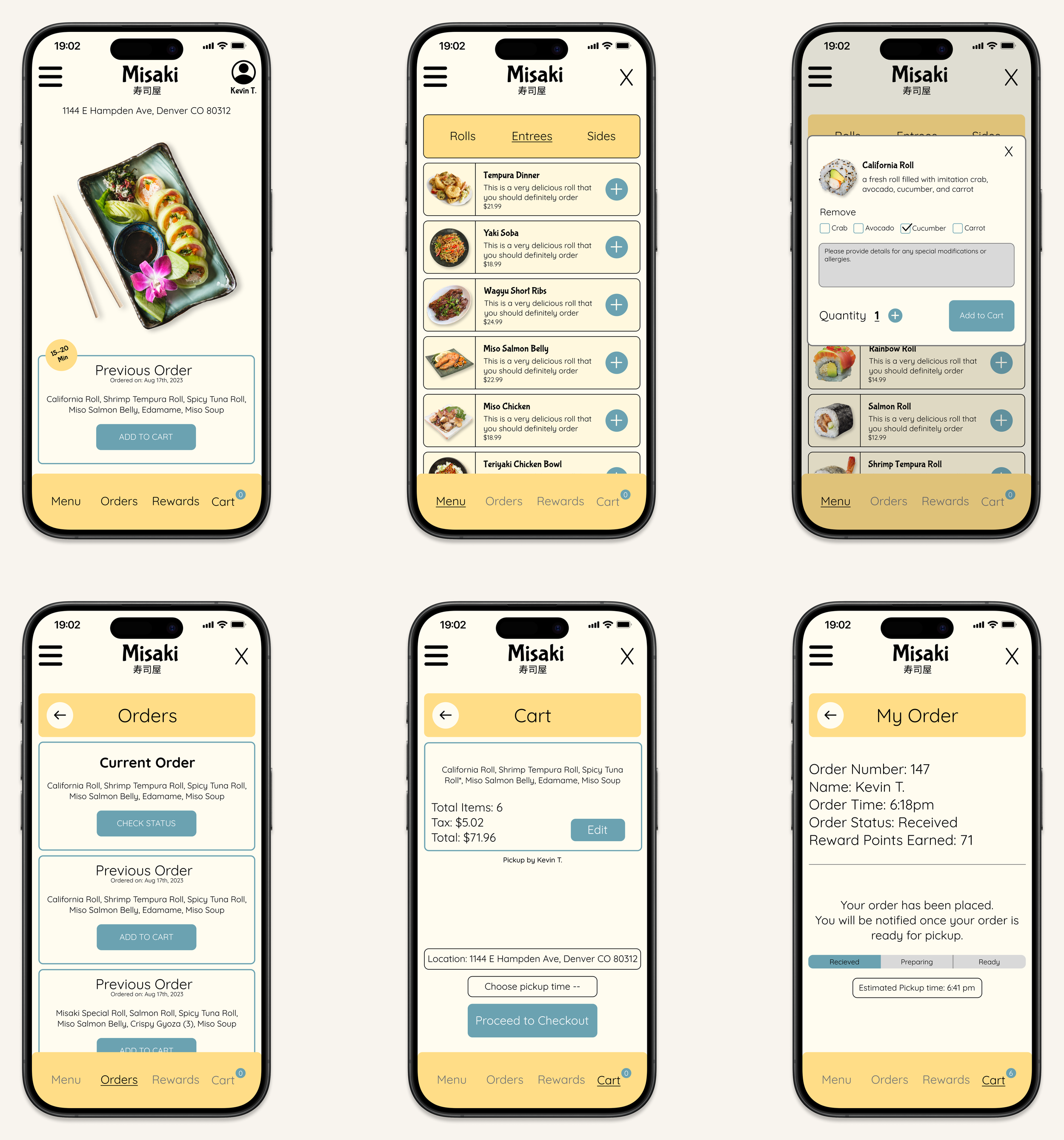
Final Design

Usability Considerations:
Used icons and pictures to help make navigation easier.
Made sure text and color contrast met WCAG standards.
Limited the amount of written text for easier communication for users with reading or language impairments.
Takeaways:
Impact:
By focusing on the speed and efficiency of the ordering flow, users can spend less time on the app and more time with their families. Improving the speed and efficiency of the ordering process could also increase the frequency of orders and sales that go to Misaki.
What I learned:
There were many functions and accessibility features that I didn’t consider until conducting usability studies. Receiving feedback from real users helped in my understanding of what a functional and cohesive application should look and feel like. My competitive analysis was a good learning opportunity as well about effectiveness in already existing popular applications. In the end, the entire design process was a great learning experience for designing a proprietary app from start to finish.
Next Steps:
Conduct another round of usability studies to validate whether the pain points users experienced during the first rounds of usability studies have been effectively addressed.
Conduct more user research to determine any new areas of need.
Continue to audit competitor apps to update the Misaki app with new and accessible features.
Create and measure KPIs that meet the business needs. Some potential KPIs to focus on could include:
Average Order Value
Order Frequency
Conversion Rate
Cart Abandonment Rate
Retention Rate
Revenue Growth
Customer Feedback and Reviews